Website Embedding
Embedding
Embedding a bot to your existing site is quite straightforward. You will need to deploy your bot to a server or hosting provider and make it accessible via a URL. You will then be able to add the following script tag to the end of your index.html page.
NB: Remember to replace <your-url-here> with the URL of your bot!
<script src="<your-url-here>/assets/modules/channel-web/inject.js"></script>
After the import script above you need to initialize the bot to the window object with the script below.
<script>
  window.botpressWebChat.init({ host: '<your-url-here>', botId: '<your-bot-id>' })
</script>
And that's it! Once you deploy the changes to your website, the bot will become available, and its button will appear.
There is an example included in the default botpress installation at http://localhost:3000/assets/modules/channel-web/examples/embedded-webchat.html
Additional Options
| Property | Description |
|---|---|
| ref | The trusted reference of the user origin (generated by security sdk) |
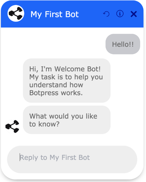
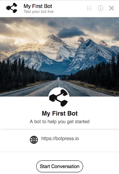
Bot Information page
The information page displays information like the website url, a phone number, an e-mail contact address, and links to terms of services and privacy policies. You can also include a cover picture and an avatar for your bot.
How to set up the information page:
- On the Admin UI, click on the link
Confignext to the name of the bot you want to change. - Edit your bot information in the
More detailsandPicturessections. - Edit the file
data/global/config/channel-web.jsonand setshowBotInfoPagetotrue** - Refresh your browser.
You will see the page when starting a new conversation. The page is always accessible by clicking on the information icon in the top right corner of the chat window.
** We edited the
globalconfiguration file for the sake of simplicity. To enable the bot information page on a single bot, you will need to copy the filedata/global/config/channel-web.jsonto your bot folderdata/bots/BOT_NAME/config/channel-web.jsonand edit that file.
Show and hide automatically
If the default Botpress button doesn't work for you, it can be changed by adding a click event listener to any element on the page. You will also need to pass the hideWidget key to your init function like this:
<script>
  window.botpressWebChat.init({ host: '<your-url-here>', botId: '<your-bot-id>', hideWidget: true })
</script>
Here is some sample code for adding the event listeners to your custom elements:
<script>
  document.getElementById('show-bp').addEventListener('click', () => {
    window.botpressWebChat.sendEvent({ type: 'show' })
    window.botpressWebChat.sendEvent({ type: 'message', text: 'Hello!' })
  })
  document.getElementById('hide-bp').addEventListener('click', () => {
    window.botpressWebChat.sendEvent({ type: 'hide' })
  })
</script>
Others events
There are more events you can trigger by calling the window.botpressWebChat.sendEvent() function.
| name | Description |
|---|---|
show | This event open the webchat |
hide | This event close the webchat |
toggle | This event open or close the webchat depends on its current state |
message | This event send a message (see example above) |
toggleBotInfo | This event switches between bot infos and conversation page |
Obtaining the User ID of your visitor
It may be useful to fetch the current visitor ID to either save it in your database or to update some attributes in the Botpress DB.
Since the webchat is running in an iframe, communication between frames is done by posting messages. The chat will dispatch an event when the user id is set, which you can listen for on your own page.
window.addEventListener('message', message => {
  if (message.data.userId) {
    console.log(`The User ID is ` + message.data.userId)
  }
})
Configure at runtime
The method window.botpressWebChat.configure allows you to change the configuration of the chat during a conversation without having to reload the page.
Advanced Customization
Every message sent by the bot to a user consist of a payload. That payload has a type property, that tells the webchat how the other information included on that payload should be rendered on screen.
There are different ways to send that payload to the user:
- Sending a Content Element via the Flow Editor example here
- Sending an event via Hooks or Actions example here
There are multiple types already built in Botpress (they are listed at the bottom of this page), but if you require more advanced components, you can create them easily.
Prevent storing sensitive information
By default, the complete payload is stored in the database, so the information is not lost when the user refreshes the page. On some occasion, however, we may want to hide some properties deemed "sensitive" (ex: password, credit card, etc..).
To remove this information, there is a special property that you need to set: sensitive. Here's an example:
const payload = {
  type: 'login_prompt',
  username: 'someuser',
  password: 'abc123',
  sensitive: ['password']
}

// This is the information that will be persisted: { type: 'login_prompt', username: 'someuser' }
Changing avatar for messages
If you need to display different bot's avatar for some of the messages (like imitating changing author) you can achieve that by setting botAvatarUrl like this:
const payload = {
  type: 'text',
  botAvatarUrl: 'http://some.url'
  text: 'Lorem ipsum'
}
Creating a Custom Component
We already have an example module showing how to create them, so we will just make a quick recap here. The Debugger is also implemented entirely as a custom component in the extensions module, so don't hesitate to take a look on how it was implemented.
Custom components leverages the custom payload type, which allows you to inject any valid React component exported from a custom module.
- Create a module (we have example templates here)
- Develop your component
- Export your component in the
lite.jsxfile (here's a couple of different ways to do it) - Send a custom payload to the user:
payload: {
  type: 'custom' // Important, this is how the magic operates
  module: 'myModule' // The name of your module, must match the one in package.json
  component: 'YourComponent' // This is the name of the component, exported from lite.jsx
  // Feel free to add any other properties here, they will all be passed down to your component
  myCustomProp1: 'somemorestuff'
  someOtherProperty: 'anything'
}
What can I do in my component ?
There are a couple of properties that are passed down to your custom component. These can be used to customize the displayed information, and/or to pursue interactions.
| Property | Description |
|---|---|
| ...props | The payload properties are available on the root object (this.props.) |
| onSendData | This method can be used to send a payload to the bot on the behalf of the user |
| onFileUpload | Instead of sending an event, this will upload the specified file |
| sentOn | This is the timestamp of the message. |
| isLastGroup | Indicates if your component is part of the group of messages sent by the bot |
| isLastOfGroup | Indicates if your component is the last message in its group |
| keyboard | This object allows you to manipulate the keyboard (more below) |
| wrapped | Represent any child components (more below) |
| incomingEventId | The ID of the incoming event which was processed |
| store | Grants access to the MOBX store of Channel Web (more on that below) |
isLastGroup and isLastOfGroup can be combined to let your component know if the current message is the last one the user is seeing. This can be used, for example, to display feedback buttons, a login form or anything else, that will disappear when the user continues the discussion.
The Store
The store orchestrate everything happening on the webchat: whether those buttons are displayed, which page is currently displayed, how to handle configuration changes, etc. This means that your component has a lot of flexibility. Here's a sample of the methods that you can use click here to see all of them:
- Hide or Show the chat
- Add or Remove header buttons
- Change the size of the chat window
- Send messages or payloads
- Create a new conversation
- Update any configuration option
- Set a wrapper which will wrap every single message (more on that below)
Basically, anything you can do while clicking on the UI can be done by your component.
Injecting your components
Some components can be replaced by your own. There are also some placeholders which doesn't have any components, but you can inject yours. When you inject a component, it will receive the original component, so you can just wrap it or change it completely. If there's a problem with your component, it will be replaced by the original one.
| Location | Description |
|---|---|
| below_conversation | This component would be displayed just below the composer |
| before_container | This is displayed before the chat container (the debugger uses it) |
| composer | This allows you to replace the zone where the user is typing |
How to configure them:
window.botpressWebChat.init({
...
  overrides: {
    before_container: [
      {
        module: 'extensions',
        component: 'Debugger'
      }
    ]
  }
})
Wrappers
Wrappers allows you to transform the content of a payload before passing it down to the renderer, or to another component. We have some example components here
Here's an example of a wrapped text message:
payload: {
  type: 'custom',
  module: 'myModule',
  component: 'MyComponent'
  wrapped: {
    type: 'text'
    text: 'Hello user!'
  }
}
It is also possible to chain multiple custom components using the wrapped property
Keyboards
Keyboard allows you to add elements before or after the composer. Keyboard items can be buttons, or any other type of valid component. Use Keyboard.Prepend to display it before the composer, and Keyboard.Append to display it after.
...
render(){
  // First of all, import the keyboard object
  const Keyboard = this.props.keyboard

  // Create any type of component
  const something = <div>This will be displayed over the composer, as long as visible is true</div>

  // Your custom keyboard will only be displayed if that message is the last one displayed
  const visible = this.props.isLastGroup && this.props.isLastOfGroup

  return (
    <Keyboard.Prepend keyboard={something} visible={visible}>
      This text will be displayed in the chat window
    </Keyboard.Prepend>à
  )
}
Using a Button Keyboard
There is a built hook that makes it easy to add buttons to any kind of element. You can pass down an array of buttons, or an array of array of buttons.
const payload = {
  type: 'text'
  text: 'hello',
  quick_replies: [
      [{ label: 'row 1, button 1', payload: 'something' }, { label: 'row 1, button 2', payload: 'something' }],
      [{ label: 'row 2, button 1', payload: 'something' }],
      [{ label: 'row 3, button 1', payload: 'something' }]
    ]
}
Customizing Web Chat Style
Step 1: Styling (CSS)
Paste the following CSS file in the <botpress_dir>/data/assets/modules/channel-web folder. Feel free to change the style here. Original Botpress theme can be found here.
.bpw-from-bot .bpw-chat-bubble {
  background-color: #ececec;
}

.bpw-chat-bubble:last-of-type {
  border-bottom-right-radius: 20px;
  border-bottom-left-radius: 20px;
}

.bpw-chat-bubble:first-of-type {
  border-top-left-radius: 20px;
  border-top-right-radius: 20px;
}

.bpw-from-user .bpw-chat-bubble:last-of-type {
  border-bottom-right-radius: 0px;
}

.bpw-from-bot .bpw-chat-bubble:last-of-type {
  border-bottom-left-radius: 0px;
}

.bpw-from-user .bpw-chat-bubble {
  background-color: #4278f3;
  color: #ffffff;
}

.bpw-date-container .bpw-small-line {
  border-bottom: none;
}

.bpw-date-container {
  font-weight: 700;
  font-size: 14px;
}

.bpw-header-container {
  background-color: #f8f8f8;
  border-bottom: none;
}

.bpw-bot-avatar img,
.bpw-bot-avatar svg {
  border: none;
  border-radius: 50%;
}

.bpw-composer {
  padding: 10px;
  background: none;
  border: none;
}

.bpw-composer textarea {
  background: #ececec;
  border-radius: 20px;
  font-size: 1.25rem;
  overflow: hidden;
}

.send-btn {
  position: absolute;
  right: 30px;
  bottom: 28px;
  border: none;
  border-radius: 5px;
  background: #fff;
  padding: 5px;
  font-size: 14px;
  font-weight: 500;
  cursor: pointer;
}

.send-btn:hover {
  background: #d8d8d8;
}
Step 2: Loading CSS File
Now, we need to instruct Botpress to use this custom CSS file for theming the webchat. For this, place the following code snippet in the <botpress_dir>/data/global/hooks/after_bot_mount folder. In our case, we used 01_create_shortlink.js as the file name.
const chatOptions = {
  hideWidget: true,
  config: {
    enableReset: true,
    enableTranscriptDownload: true,
    extraStylesheet: '/assets/modules/channel-web/chat.css'
  }
}

const params = {
  m: 'channel-web',
  v: 'Fullscreen',
  options: JSON.stringify(chatOptions)
}

setTimeout(() => {
  try {
    bp.http.deleteShortLink(botId)
  } catch (e) {}

  // Bot will be available at $EXTERNAL_URL/s/$BOT_NAME
  bp.http.createShortLink(botId, `${process.EXTERNAL_URL}/lite/${botId}/`, params)
}, 500)
Feel free to change the webchat config there, the important line to keep is the extraStylesheet property.
Result
Restart Botpress Server, and now your bot's default webchat will use your custom CSS theme! Here's our example: